|
Copyright
©1991, 1992, 1995-97 Hewlett-Packard Corporation.
1.0 Introduction
| 2.0
Latin Text and Display | 3.0 Latin Hand
Written
4.0
Latin Decorative | 5.0 Latin
Pictoral | 6.0
Summary of Variables
7.0
Calculated Variables | 8.0
PANOSE Submission Form
9.0
PANOSE Classification Sheet
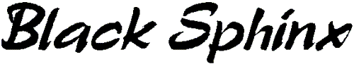
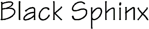
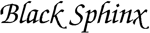
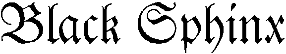
3.0
Latin Hand Written
3.1
Family Kind
Sub-digits
0-Any
1-No Fit
2-Latin Text
3-Latin Hand Written
4-Latin Decorative
5-Latin Symbol
Description
Many fonts
are clearly scripts and unrelated to any book face. On occasion,
though, the distinction gets rather vague. A good rule of thumb is that
if the cursive font is part a family that includes a book face, then it
should be classified in the Latin Text group. If it is freestanding
with no obvious related book face, then it falls into the Latin Hand
Written group. This can be a bit difficult to determine, since a font
house may only choose to provide the cursive from a larger family, so
the classifier needs to think about the face being processed and not do
it purely by rote.
3.2
Tool kind
Sub-digits
0-Any
1-No Fit
2-Flat Nib
3-Pressure Point
4-Engraved
5-Ball (Round Cap)
6-Brush
7-Rough
8-Felt Pen/Brush Tip
9-Wild Brush - Drips a lot
Description
Kind of
implement predominately used to create character forms. A flat
nib is an inflexible rectangular nib, like a standard
calligraphy pen nib, whose line width is dependent only on the angle of
the edge of the nib with respect to the line. A pressure point
is a flexible point, like those used to do copperplate lettering, which
spreads when pressed down upon and forms a wider line. Engraved
cursive lettering has many of the characteristics of pressure point,
but it also has fine added lines that could only be made with a graver.
Ball is the type of line produced by a
ball point pen or similar round nib. It has a single line weight and
convexly rounded stem caps. Brush means a
rectangular brush. It looks superficially like a flat nib but has more
fluid stroke endings and gentle swellings along strokes as a brush
would make responding to pressure. Rough looks like
the lettering was done with a rough edged nib or a nib that was too dry
or on a rough surface. It is characterized by unpredictable starts and
stops within the letter. Felt tip or brush
tip looks somewhat like the Ball nib but has the
characteristic swellings within the line of a more flexible instrument.
Wild brush looks hastily or sloppily
done with drips and splatters of ink in unpredictable places. The
difference between this and a decorative lettering is often minimal and
based on readability and whether there is a full family of letter forms
(book, italic, bold, and bold italic).
Examples
Figure
15 - Hand Written Tool Kinds
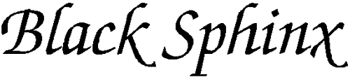
2
- Flat Nib
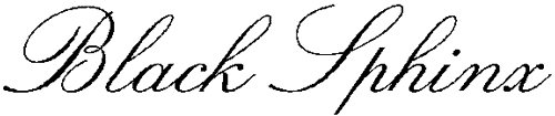
3
- Pressure Point
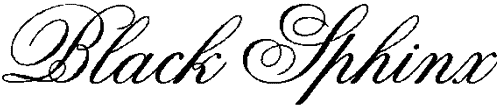
4
- Engraved
5
- Ball
6
- Brush
7
- Rough
8
- Felt Tip / Brush Tip
9
- Wild Brush
3.3
Weight
Sub-digits
0-Any
1-No Fit
2-Very Light
3-Light
4-Thin
5-Book
6-Medium
7-Demi
8-Bold
9-Heavy
10-Black
11-Extra Black (Nord)
Description
The Weight
digit classifies the appearance of a font’s stroke thickness in
relation to its height. This is expressed as a ratio taken from two
measurements on the uppercase E glyph. See Section 2.
Measurements
Two
measurements are required for classification of the Weight digit.
CapH
CapH (Figure
2)is the cap height and is measured on the uppercase H, from
the top-most Y-extent to the bottom-most Y-extent at the theoretical
midline of the left vertical stroke. The midline is chosen to avoid
serifs that extend the height or depth of the character shape. This is
a vertical measurement even if the glyph is italic or oblique.
WStem(E)
The width of the vertical stem, WStem(E) (Figure
5), is measured horizontally on the uppercase E at a point
halfway between the upper two arms. This measurement is the width of
the vertical stem, or back bone, of the character and is taken
perpendicular to the stem. In the case of an oblique letter, the
horizontal axis is shifted to be perpendicular to the stem. Note: For
the purpose of serif designs, this measurement is applied to the large
(400 point) uppercase I glyph.
Calculated
Variables
Only one
calculated variable (WeightRat) is used to determine the Weight digit
for the PANOSE Typeface Matching System. The WeightRat variable is
calculated by dividing the cap height by the width of the vertical stem.
WeightRat =
CapH / WStem(E)
Classification
To determine
the exact PANOSE Weight digit, round the WeightRat value to two decimal
places and match it in the following table:
0-Any
1-No fit
2-Very Light….……WeightRat ³35
3-Light……….18 £
WeightRat < 35
4-Thin……….10 £ WeightRat
< 18
5-Book………7.5 £ WeightRat
< 10
6-Medium……5.5 £WeightRat
< 7.5
7-Demi………4.5 £WeightRat < 5.5
8-Bold……….3.5 £WeightRat
< 4.5
9-Heavy……..2.5 £WeightRat
< 3.5
10-Black……..2.0 £WeightRat
< 2.5
11-Extra Black…….WeightRat <2.0
Notes
The
tolerances of the weight classification have been determined by testing
a variety of fonts. While this has provided reasonable averages for the
ranges of weights, these will not always directly correspond with a
font’s external name. It is not uncommon to have a font that contains
the word "Bold" in the name that actually classifies as 7-Demibold.
In addition,
certain families that have a surplus of font weights may not progress
smoothly through the differing classification options. It is, however,
rare that two fonts within the same family will have two weights that
exist in the same classification category. Notify Hewlett-Packard of
any cases where this occurs.
Caution on
measurements: When measuring a design with a highly rounded or bowed
inside stem, be certain to calculate the correct theoretical edge for
the location of the stem edge. Curved stems can alter the measurements
for classification significantly enough to alter the resulting category.
3.4
Spacing
Sub-digits
0-Any
1-No fit
2-Proportional Spaced
3-Monospaced
Description
This
digit allows monospaced and proportional fonts to be distinguished.
3.5
Aspect Ratio
Sub-digits
0-Any
1-No Fit
2-Very Condensed
3-Condensed
4-Normal
5-Expanded
6-Very Expanded
Description
This is the
ratio between the width and the height of the face measured using the
Upper O(Figure
7)
Measurements
OWid
The OWid(Figure
7) horizontal measurement reflects the general width of the
uppercase O glyph. It is measured from the left-most extent of the left
side of the stroke, to the right-most extent of the right side of the
stroke.
OTall
OTall(Figure
7) depicts the height of the uppercase O glyph. It is a
vertical measurement from the outside edge of the stroke at the
top-most extent to the outside edge of the stroke at the bottom-most
extent of the glyph. Skewed, italic, or oblique characters should not
skew this measurement. It should remain strictly vertical.
Calculated
Variable
ORat
= OTall / OWid
Classification
0-Any
1-No Fit
2-Very Condensed………….ORat ³
2.1
3-Condensed ….…….1.27 £ORat
< 2.1
4-Normal …….……..0.92 £ORat
< 1.27
5-Expanded…….….. 0.90 £ORat
£ 0.92
6-Very Expanded ………….ORat <
0.90
3.6
Contrast
Sub-digits
0-Any
1-No Fit
2-None
3-Very Low
4-Low
5-Medium Low
6-Medium
7-Medium High
8-High
9-Very High
Description
The Contrast
digit describes the ratio between the thickest point on the letter O
and the narrowest point on the letter O. This ratio is called the
ConRat and involves two relatively straight forward measurements.
The glyph
shape of the uppercase O is used to calculate the contrast digit
because it is generally of higher contrast than the other characters of
the alphabet. For instance, the thick segments of the uppercase O are
wider than the thick segments of other letters of the alphabet. This
emphasis on contrast with the rounded character shapes is used because
it emphasizes the contrast of the character shape, thus giving greater
separation of visual traits in classification. The ratio of narrow to
wide is used for contrast because it defines the degree of variation in
the letterform as it changes from thick to thin.
This
measurement should not be confused with the sixth PANOSE digit, Stroke
Variation. Stroke variation classifies the transition process between
the thick and thin segments of the uppercase O, the relative values
themselves.
Measurements
The contrast
digit is calculated using two measurements, WideO() and NarO. These two
measurements are often quite simple to determine. With advanced or
calligraphic character shapes determining the location where the stem
is at its maximum or minimum width is often more challenging. For this
reason, it is recommended that a large sample is used to calculate the
Contrast digit.
WideO
WideO (Figure
7) variable is assigned by measuring the stem of the
uppercase O glyph where it is thickest. Often this will be at the right
or left-most extent of the letter-form, measured in a horizontal line.
NarO
Similar to WideO, NarO (Figure
7) is assigned by measuring the narrowest point of the
uppercase O glyph, usually the top most extent of the letter-form and,
in this case, is measured vertically.
If diagonal
stress has been applied to the shape of the uppercase O glyph the
points of highest contrast may not occur at the top and bottom or
furthest left and right extent of the glyph. In this case, WideO and
NarO are the positions on the glyph where the difference between the
inside and outside radials has the maximum and minimum value
respectively.
The rule for
determining the radials for the purpose of this classification method
is that they must cross the outer edge of the glyph perpendicular to a
line that is tangent to the stroke. The radials can usually be
determined by locating the character center and drawing a line straight
out through the glyph. Yet, in some exaggerated letterforms,
specifically flattened, rounded, or off-center glyph shapes, a
center-based radial will not provide a measurement that is
perpendicular to the stroke. In these complex character shapes, the
WideO and NarO must be measured using the radial differences method
mentioned in the previous paragraph.
Calculated
Variables
ConRat
ConRat = NarO / WideO
If the ConRat variable is greater than one, there is horizontal stress
on the letter; Transpose the calculation and recalculate it (i.e.,
ConRat = WideO/NarO).
Classification
To determine
the exact PANOSE digit for contrast, fit the contrast ratio (ConRat)
into the following table:
0-Any
1-No Fit
2-None……………..0.80 <ConRat
3-Very Low………..0.65 <ConRat
£ 0.80
4-Low………………0.48 <ConRat
£ 0.65
5-Medium Low…….0.30 <ConRat
£ 0.48
6-Medium………….0.20 <ConRat
£ 0.30
7-Medium High…… 0.15 <ConRat
£ 0.20
8-High…………….. 0.08 <ConRat
£ 0.15
9-Very High ………………ConRat £0.08
3.7
Topology
Sub-digits
0-Any
1-No Fit
2-Roman Disconnected
3-Roman Trailing
4-Roman Connected
5-Cursive Disconnected
6-Cursive Trailing
7-Cursive Connected
8-Blackletter Disconnected
9-Blackletter Trailing
10-Blackletter Connected
Description
The topology
classification is a two step process. First the cursive face is
separated into Roman, Cursive, and Blackletter based on the letterforms
and then the connections between the letters are classified. Roman
means that the letterforms are still similar to
upright faces, but have been slanted to from a cursive. These faces
tend to look like hand printing. Cursive means that
some characters, such as the lower a and g, have been modified to look
more like hand written forms. These faces tend to look like flowing
script handwriting. Blackletter implies that there
have been major modifications to many of the letterforms. These faces
tend to be very black and condensed and often feel angry or aggressive.
Disconnected means that each letter is
distinct and there is no connection from one to the next.
Trailing means that the trailing serifs of the letters,
usually along the baseline, have been extended so that they may overlap
with the following character. Connected means that
the letterforms have been constructed so that they connect to their
neighbors explicitly.
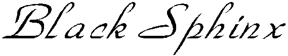
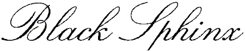
Examples
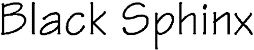
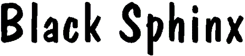
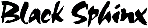
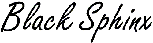
Figure
16 - Hand Written Styles
Roman
Cursive
Blackletter
Figure
17 - Connections

Disconnected
Trailing
Connected
3.8
Form
Sub-digits
0-Any
1-No Fit
2-Upright / No Wrapping
3-Upright / Some Wrapping
4-Upright / More Wrapping
5-Upright / Extreme Wrapping
6-Oblique / No Wrapping
7-Oblique / Some Wrapping
8-Oblique / More Wrapping
9-Oblique / Extreme Wrapping
10-Exaggerated / No Wrapping
11-Exaggerated / Some Wrapping
12-Exaggerated / More Wrapping
13-Exaggerated / Extreme Wrapping
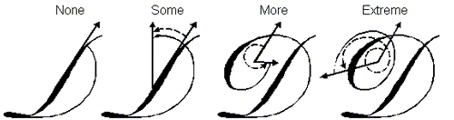
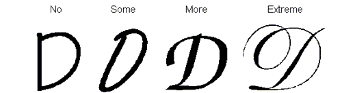
Description
The form
digit tries to measure the general look of the face. It combines two
measures, the slope of the verticals and the wrap of the tails of
connecting strokes, such as the curving stroke in the Upper D.
Example
Figure
18 - Wrapping Measure
Figure
19 - Wrapping
Measurements
Slant
The slant (Figure
2) is measured up the center of the Upper H left vertical
stem, with respect to the Baseline.
Wrap
The wrap is measured on the Upper D where the bowed stem meets the
vertical stem.
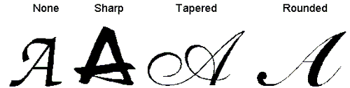
Classification
0º £ Slant <
5º……. Upright
5º £ Slant < 15º……Oblique
15º £ Slant………..Exaggerated
Curving D
stem meets vertical stem………………………………….…………No Wrapping
Curving D stem passes vertical stem but does not curve more than
90º….Some Wrapping
Curving D stem passes vertical stem but curves less than 360º…………..More
Wrapping
Curving D stem passes vertical stem but curves more than
360º…………Extreme Wrapping
3.9
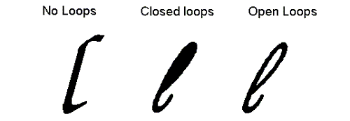
Finials
Sub-digits
0-Any
1-No Fit
2-None / No loops
3-None / Closed loops
4-None / Open loops
5-Sharp / No loops
6-Sharp / Closed loops
7-Sharp / Open loops
8-Tapered / No loops
9-Tapered / Closed loops
10-Tapered / Open loops
11-Round / No loops
12-Round / Closed loops
13-Round / Open loops
Description
Finials
combines the treatment of the ends of characters, like the foot at the
right bottom of the upper a, with the treatment of the ascenders of the
lower case characters. If there is no extra treatment of the stroke
end, other than what the lettering nib would naturally do, that is a none.
If has been chopped off abruptly, that is a sharp,
if it has been tapered to a narrower width than the nib would naturally
create, that is a tapered. If it has been made
bulbous that is rounded. The classification of
ascenders into no loops, open loops and closed loops is usually
unambiguous.
Examples
Figure
20 - Finials
Figure
21 - Ascenders
3.10
X-Ascent
Sub-digits
0-Any
1-No Fit
2-Very Low
3-Low
4-Medium
5-High
6-Very High
Description
The X-ascent
digit measures the relative size of the lowercase characters.
Measurements
Two
measurements are used for calculating the X-height. The height of the
uppercase glyph for the typeface has already been measured in the Serif
Style digit by means of the CapH variable. The lowercase height is
measured as described in XTall. Similarly, the uppercase is evaluated
to determine how the glyph height is altered to account for diacritical
marks.
XTall
XTall (Figure
13)is the measurement of the lowercase characters from the
baseline vertically to the upper extent of the upper left stem of the
lowercase x.
CapH
CapH(Figure
2) is the cap height and it is measured on the uppercase H,
from the top-most Y-extent to the bottom-most Y-extent along the
theoretical midline of the left vertical stroke. The midline is chosen
to avoid serifs that extend the height or depth of the character shape.
This is a vertical measurement regardless of whether the character is
italic or oblique.
Calculated
Variables
XRat
= XTall / CapH
Classification
The XRat
variable is used to determine the relative size of the lowercase. The
table below is used to classify fonts based on the XRat.
Very Low
……………XRat £ 0.40
Low…………….0.4 <XRat
£0.50
Medium.………0.50 <XRat
£0.66
High……………0.66 < XRat £0.75
Very High………0.75 <XRat
Top
Section 4.0
|