|
Copyright
©1991, 1992, 1995-97 Hewlett-Packard Corporation.
All rights
reserved. No part of this publication may be reproduced, stored in a
retrieval system, or transmitted, in any form or by any means,
electronic, mechanical, recording, or otherwise, without the prior
written permission of Hewlett-Packard Corporation.
The
information in this guide is furnished for informational use only, is
subject to change without notice, and should not be construed as a
commitment by Hewlett-Packard Corporation. Hewlett-Packard Corporation
assumes no responsibility or liability for any errors or inaccuracies
that may appear in this book. The classification system described in
this guide is furnished under license and may only be used or copied in
accordance with the terms of such license.
Hewlett-Packard,
PANOSE, PANOSE Classification Numbers, and PANOSE digits are trademarks
of Hewlett-Packard Corporation. Other brand or product names are the
trademarks or registered trademarks of their respective holders.
For
additional information, please contact us at
info@monotype.com.
Printed in the United States of America
Printed: February 14, 1997
Index
1.0 Introduction
| 2.0
Latin Text and Display | 3.0 Latin Hand
Written
4.0
Latin Decorative | 5.0 Latin
Pictoral | 6.0
Summary of Variables
7.0
Calculated Variables | 8.0
PANOSE Submission Form
9.0
PANOSE Classification Sheet
1.0
Introduction
1.1
PANOSE Classification
1.1.1
Metrics Guide
The PANOSE
Typeface Matching System was developed by Benjamin Bauermeister and is
exclusively licensed to Hewlett-Packard Corporation in Seattle,
Washington. Under copyright this document is being provided to third
party vendors of typeface products and type related utilities to aid in
understanding the details of the PANOSE Typeface Matching System and to
describe the process of assigning PANOSE Classification Numbers to
typefaces.
Hewlett-Packard
does not restrict the use of PANOSE Classification Numbers in typeface
products developed by third parties. Hewlett-Packard does however
strongly urge you to submit written notice and samples of typefaces
developed with the PANOSE Typeface Matching System to Hewlett-Packard
Corporation. Submission forms are available in
Section 8 of this document This provides Hewlett-Packard with
the information necessary to enhance, expand, and solidify the PANOSE
Typeface Matching System as it is applied to an increasing variety of
font designs. We welcome your feedback.
In addition
Hewlett-Packard reserves the use of the PANOSE trademark exclusively
for typefaces that have been officially verified and registered with
Hewlett-Packard. PANOSE licensing information can be obtained by contacting us.
Typeface classification and verification services are also available
from Hewlett-Packard. Fonts classified by Hewlett-Packard are allowed
full use of the PANOSE trademark. Sample classification submission
forms are found in
Section 9 of this document. Separate licensing is available
for use of the mapping algorithms for cross platform and web font
solutions.
1.1.2
Overview
This document
provides a detailed record of the process required to classify a Latin
text, display, handwritten, or decorative face or symbolic fonts with
the PANOSE Typeface Matching System. Great care has gone into making
this document as complete as possible in order to avoid any conflicts
or confusion that may arise in the classification of typefaces.
However, with the varied world of type design, this document is subject
to change as more data regarding lesser known faces become available.
Please feel free to send your additions or clarifications to by contacting us
The process
of determining a PANOSE Classification Number starts with a series of
measurements. While the total number of measurements is nearing
sixty-five for a text font, far fewer are required to classify most
typeface designs. Still, until the classification parameters are
familiar, diligence should win out over expediency in the pursuit of
creating PANOSE Classification Numbers that are consistent and correct.
Ratios are
computed using the measured values. The classification criteria for
PANOSE is based on these inter-related ratios. Because of this, PANOSE
measurements can be taken on samples of type at any size, as long as
the measurement system is not changed during the classification process
of a given face.
The rules for
proper measurement, laid out below, are being refined so that minimal
human intervention will be required to classify a typeface. At this
time, however, there are no approved tools for the automation of PANOSE
Classification Number assignment. This document tries to provide
detailed descriptions about the mechanics of measuring every attribute,
while presenting methods to quickly glean the same information using
visual feedback only.
PANOSE is a
classification system for visual attributes of type only. There is no
information contained within a PANOSE Classification Number that
pertains to the character widths, spacing metrics, or advance widths.
This simplifies the process of classification because we only describe
attributes that can be seen and measured.
Figure
1 - PANOSE Universe
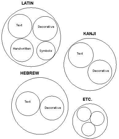
PANOSE
Classification Numbers used in static outline fonts consist of ten
digits. The first digit defines what type of font is being classified
(Latin Text, Symbolic, Japanese Decorative, etc.) (Figure 1) and the
following 9 provide classification within that type. Thus digits 2
through 10 change meaning depending on what the first digit is. There
is always a digit that expresses weight, one that expresses aspect
ratio, and a monospace / proportional flag but their position may
change depending on the type of font. The order of the digits is
roughly the order in which they are useful in maximizing the separation
of closely related faces. Thus the position of digits expressing the
same quantity (for example aspect ratio) will not always be the same
(it is digit 4 in Latin Text and 5 in Latin Handwritten). Below is a
summary of all the digits in all the presently defined font types:
Latin Text:
1. Family Kind (= 2 for Latin Text)
2. Serif Style
3. Weight
4. Proportion
5. Contrast
6. Stroke Variation
7. Arm Style
8. Letterform
9. Midline
10. X-height
Latin Hand
Written:
1. Family Kind (= 3 for Latin Hand Written)
2. Tool Kind
3. Weight
4. Spacing
5. Aspect Ratio
6. Contrast
7. Topology
8. Form
9. Finials
10. X-ascent
Latin
Decoratives:
1. Family Kind (= 4 for Latin Decorative)
2. Class
3. Weight
4. Aspect
5. Contrast
6. Serif Variant
7. Treatment
8. Lining
9. Topology
10. Range of Characters
Latin Symbol:
1. Family Kind (= 5 for Latin Symbol)
2. Kind
3. Weight
4. Spacing
5. Aspect Ratio & Contrast
6. Aspect Ratio of Character 94
7. Aspect Ratio of Character 119
8. Aspect Ratio of Character 157
9. Aspect Ratio of Character 163
10. Aspect Ratio of Character 211
PANOSE uses
an expanded form for other applications such as distortable type.
Contact Hewlett-Packard Corporation for more information about the
expanded form of PANOSE.
While
measuring typefaces for the PANOSE Typeface Measuring System is
generally straightforward, be aware of the following special
considerations when classifying a typeface to assign a PANOSE
Classification Number:
1.1.3
Italic Character Forms
This version
of the PANOSE Classification Metrics Guide not only contains specific
weight settings for fonts, but also contains classification parameters
to isolated italic fonts based on their character skew. There are
several measurements in this classification document that require
special treatment if an italic font is being classified. Sometimes the
horizontal distance between two points is required and the two points
are not on the same horizontal plane. A simple measurement of the
horizontal distance between these points is not going to yield accurate
results. Compensating for the character skew when the measurement is
taken will result in proper compliance with the PANOSE Typeface
Matching System scheme. Whenever possible, the special cases of
compensation for italic fonts have been noted in this document.
1.2
Classification Samples
It is
important to work from a properly printed character sample when
measuring a typeface to determine its PANOSE Classification Number.
Unlike other systems of classification, a large type sample does not
necessarily benefit the process of assigning PANOSE Classification
Numbers, in fact, it often hinders the classification process. Keep the
following concerns in mind when generating printed samples for PANOSE
measurement. A sample classification sheet is available in section 9 of
this document.
1.2.1
Size
The printed
sample characters should be large enough to view the details of the
characters clearly. More importantly, make certain that all the
rasterization hints applied to the character form are diminished and no
longer affect the glyph outline. Characters of 200 points in size are
sufficient for most PANOSE classifications. The exception to this is
the uppercase O, which is used to determine the Letterform and Stroke
Variation digits, and the uppercase I, which is used to determine the
Serif classification parameter. The measurements for these digits are
quite subtle and require a significantly larger character sample; 400
points in size is usually sufficient.
1.2.2
Resolution
The use of
low resolution output can be of assistance in determining a PANOSE
Classification Number. The minute stair-steps that occur in the curves
and serifs of a laser printed sample at 300 dots per inch (dpi) often
indicates the inflection point of a serif from the stem, the bow of a
stem, or the extreme boundary of a rounded character form. For this
reason, 300-600 dpi output is recommended. Additionally, hard paper
that presents each laser dot cleanly is of benefit. Resolution
enhancement technology diminishes the advantages of lower resolution
printing, yet will not adversely effect the correctness of the
measurement attained from the sample.
1.2.3
On-Screen Measurement
It is quite
possible to take the PANOSE measurements in a font editor software
package. General illustration and drawing packages are not recommended
for this process. The advantages of on-screen measurements are two
fold: the measurements can be taken at any resolution and the true
points of extremities and tangency can be located more precisely. The
only drawback in using a font editor for PANOSE measurements is that
most current tools lack elegance in the methods for measuring the
distance between two random points on an outline. Undoubtedly these
tools will change and improve over time, at which point on-screen
measurement will provide a superior alternative to printed samples.
1.3
Extents and Theoretical Edges
Two general
measurement terms frequently used in this documentation are “extents”
and “theoretical edges.”
Extents
define the upper, lower, left and right bounds of the object being
described or measured. For example, the left extent of a glyph
indicates the horizontal location where a vertical line first contacts
the shape of the glyph. Similarly, the upper extent of the uppercase O
glyph indicates the vertical location where a horizontal line first
comes in contact with the glyph shape. Extents for italics are often
determined on the skew.
Theoretical
edges are used to indicate a straight line where a very subtle curve
exists. Stem edges are often at theoretical edges because stem designs
contain slightly bowed lines-not straight-lines. A theoretical edge is
a line halfway between the right-most and left-most extents of the true
edge of a stem.
1.4
Baseline location
All of the
measurements necessary to determine a PANOSE Classification Number are
based on the visual and physical properties of the glyph shapes, not on
assumed locations of shapes, etc. The one exception to this is the
baseline location. Whenever possible, use the information available
from the system that is printing the character samples to indicate the
correct location of the baseline. If a true baseline is not provided,
the baseline is assumed to be the location of the theoretical edge of
the lower edge of the lowest horizontal arm of the uppercase E. If this
does not result in a horizontal line, the baseline is placed at the
midpoint of the aforementioned theoretical edge.
1.5
Digit values of 0 and 1
The reader
will notice that the value 0 and 1 are defined as Any and No Fit for
every digit in the PANOSE system. These have specific meanings to the
mapper. 0 means match that digit with any available digit. This allows
the mapper to handle distortable typefaces such as multiple master
fonts in which, for example, weights may be variable or serifs may
change. 1 means that the item being classified does not fit within the
present system. There are two possible causes of this. First is that
there has been no work done on that family of faces, for example at the
present time an Arabic cursive font would have the PANOSE number 1 1 1
1 1 1 1 1 1 1 as there has as yet been no work done on Arabic fonts.
The mapper will recognize the font as having a valid PANOSE number and
accept it but will only do name matching, not font substitution. The
second possibility is that within the classification scheme there is
nothing that fits the particular case that is being classified, for
example a completely new shape of serif in a Latin Text font that does
not fit the existing design space. A 1 would indicate that the serif
doesn't fit but would still allow the mapper to do substitutions. If,
in the process of classification, you find an example of something that
does not fit within the present classification scheme, please contact us
so we can evaluate it for possible expansion of the PANOSE system. We
are well aware we have not fully described the typographic universe and
are prepared to extend PANOSE as the need arises.
Top
Section2.0
|