|
Copyright ©1991, 1992, 1995-97 Hewlett-Packard Corporation.
1.0 Introduction | 2.0 Latin Text and Display | 3.0 Latin Hand Written
4.0 Latin Decorative | 5.0 Latin Pictoral | 6.0 Summary of Variables
7.0 Calculated Variables | 8.0 PANOSE Submission Form
9.0 PANOSE Classification Sheet
2.0 Latin Text
2.1 Family Kind
Sub-digits
0-Any
1-No Fit
2-Latin Text
3-Latin Hand Written
4-Latin Decorative
5-Latin Symbol
Description
The overall genre of the
alphabet or script that is being described is signified by the Family
Kind digit. This digit consists of two parts: the script kind identifier
and the genre kind identifier. In this case, the script identifier is
Latin, and the genre type is described as Text, Hand Written, Decorative
or Symbol. Extensions of the PANOSE system to other families of writing
forms (Kanji, Hebrew, Arabic, etc.) have not been defined at the time
this revision was written; contact us for more information about the extensions that are currently available.
The Family Kind digit is not
controlled by specific measurements, and there has been no attempt to
mathematically determine the appropriate category for a given font
design. Visual and aesthetic classification of Latin faces that are
obviously script, decorative, or symbol fonts is required.
General classification method
To decide whether a font belongs to the Latin Text group follow the two step process below.
A. Answer the following three
questions. If they are all yes, then it belongs in this group. If the
answer is still ambiguous, go to step B.
-
Does the font belong to a
family that includes italic versions? Most fonts in this group have a
variety of weights and most include italic versions.
-
Are the characters in the font made up of standard topologies constructed of standard parts?
-
Is some portion of the font suitable for composing a paragraph of text?
B. As a final tie breaker, look at the second digit of the Decorative (Section 4) and Handwritten (Section 3) families and see if there is something in them that fits the font in question better.
2.2 Serif Style Classification
Sub-digits
0-Any
1-No Fit
2-Cove
3-Obtuse Cove
4-Square Cove
5-Obtuse Square Cove
6-Square
7-Thin
8-Oval
9-Exaggerated
10-Triangle
11-Normal Sans
12-Obtuse Sans
13-Perpendicular Sans
14-Flared
15-Rounded
Description
The most sophisticated digit
in the PANOSE classification system is the Serif Style digit. This digit
describes the appearance of the serifs used in a font design and groups
them into one of fourteen general categories. Serif and sans serif
faces are classified within this digit, though less description is given
to the stem terminators of sans serif styles.
Measurements
The sixteen measurements
required to fully classify a serif are designed to account for the wide
variety of serif styles. Once the properties of the classification
system have been learned, fewer critical measurements may be needed to
verify the Serif Style digit. Except where noted all of the measurements
should be made on characters of the same point size.
While most calculations made
to determine the Serif Style digit are ratios, the measurement system
used for determining these values must be consistent for all Serif Style
digits. Ratios taken against the overall uppercase height, CapH,
provide this consistency.
Measurements Taken on the Upper H
The most basic font
measurements CapH, HWid and Slant are taken on the Upper H. These three
variables define the basic character of the font.
Figure 2 - Upper H
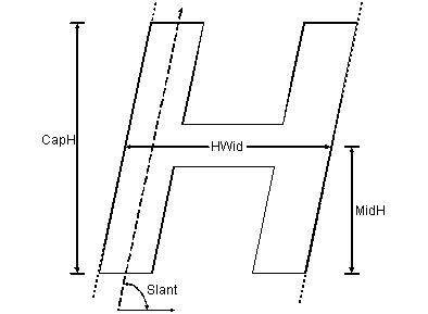
CapH
CapH(Figure 2) is the cap
height and it is measured on the uppercase H, from the top-most Y-extent
to the bottom-most Y-extent along the theoretical midline of the left
vertical stroke. The midline is chosen to avoid serifs that extend the
height or depth of the character shape. This is a vertical measurement
regardless of whether the character is italic or oblique.
Hwid
The HWid(Figure 2) is
measured on the uppercase H, from the left theoretical stem edge of the
left stem to the right theoretical stem edge of the right stem. It is
taken along an imaginary line coincident with the average horizontal
location of the character’s horizontal crossbar. The HWid measurement is
used to determine Proportion.
Slant
The Slant (Figure 2) is measured up the center of the Upper H left vertical stem, with respect to the Baseline.
MidH
The MidH (Figure 2) may be used in place of MidE if MidE is out of character with the face. See Section 2.9 - Midline.
Measurements taken on the Serif
The shape and proportions of
the serif define much of the character of a font. The following measures
are grouped to reflect their relative importance. Often a face can be
classified without resorting to the last groups.
Figure 3 - Serif Measurements
Universal serif measurements
SerTall
The height of the serif, or SerTall(Figure 3),
is a vertical measurement taken on the lower left corner of the
uppercase I, from the point that the serif departs from the vertical
stem to the baseline. Note: The point of serif departure is obvious if
printed samples are 300 dpi, but is less evident on high resolution
output.
SerTip
The height of the serif tip, SerTip(Figure 3),
is measured on the lower left-most extent of the uppercase I, from the
highest extent to the lowest extent of the serif. Note: setup is
measured to the bottom of the contour, not the baseline.
HipRad
The HipRad(Figure 3)
measurement describes the horizontal radius of the oval often formed
when the serif connects to the stem. This measurement is taken on the
uppercase I glyph. The HipRad is the distance from the theoretical left
edge of the stem on the lower left serif to either the left edge of the
serif or the point where the curve becomes tangent with a line extending
to the left edge of the serif.
Drop
Drop(Figure 3) is
the most difficult serif measurement to determine. It applies only to
serifed designs and cannot be measured on a serif whose HipRad value is
equal to the SerWidL value. Drop assumes that there is a straight line
between the left edge of the serif tip and the lowest extent of the
HipRad. Drop measures the vertical distance from the top of the serif
tip to the point of tangency with the bottom of the cove curve. As with
the other serif detail measurements, this measurement is taken on the
uppercase I.
Measurements used to calculate overall symmetry of the serif
SerWidL
The width of the lower left serif, or SerWidL(Figure 3),
is a horizontal measurement taken from the left-most extent of the
serif at the base of the uppercase I, to the left edge of the vertical
stem at the point of serif departure.
SerWidR
The width of the lower right serif or, SerWidR(Figure 3),
is taken horizontally from the right side of the vertical stem at the
point of serif departure to the right-most X-extent of the serif on the
uppercase I.
FootWid
This measurement is used to compare the overall width
of the foot of a stem with the width measurement of the stem. The
FootWid(Figure 3) is a horizontal
measurement taken at the baseline from the left-most extent to the
right-most extent of the lower serif on the uppercase I.
Measurements that apply to curved, rounded or stylized serifs
UTipRad
The upper section of the serif tip radius, UTipRad(Figure 3),
is measured vertically on the lower left serif of the uppercase I. This
vertical measurement defines the radius of the largest possible circle
drawn within the upper portion of the serif tip while retaining the
maximum points of tangency. This measurement will usually exist in
glyphs with cove or exaggerated serifs. Square serifs, thin line serifs,
and triangle serifs will often have zero UTipRad.
LTipRad
LTipRad(Figure 3)
is similar to UTipRad, but this measurement reflects the lower left hand
corner of the serif tip. Again, this is a vertical measurement taken on
the uppercase I character.
SerOff
SerOff(Figure 3)
or the serif offset is the vertical distance measured along the
theoretical mid-point of the vertical stem from the intersection of that
line with the edge of the glyph to the lowest extent of the serif on
the uppercase I. SerOff is zero for glyphs that rest fully on the
baseline.
Rare visual traits to identify more unusual sanserif designs
FootPitch
The FootPitch(Figure 10)
measurement records the angle at which the stem on a sans serif
uppercase A is terminated. Most often the measurement will be zero
indicating that the bottom of the stem is parallel to the baseline. In
some cases however, the stem is terminated perpendicular to itself,
resulting in a measurement less than 170 degrees. Note: A measurement of
180 degrees is used when the stem pitch is flat.
Figure 4 - StemCor
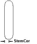
StemCor
At times the corners of a sans serif glyph’s stems are rounded instead of sharp. The StemCor (Figure 4)
variable measures the horizontal radius of the lower left corner of the
uppercase I. A fully rounded sans serif design would have a StemCor
value equal to half the stem width.<
Measurements taken on the Upper I
WStem(I)
The I stem weight, WStem(I)(Figure 3),
is measured horizontally on the uppercase I at the midpoint of the
vertical stem. This measurement is the width of the vertical stem of the
character, and is taken perpendicular to the stem. In the case of an
oblique letter, the horizontal axis is positioned perpendicular to the
stem. Note: For the purpose of serif designs, this measurement is
applied to the large (400 point) uppercase I sample glyph.
Measurements taken on the Upper E
Figure 5 - Upper E
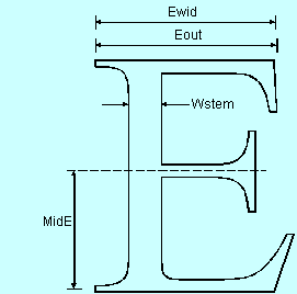
Ewid
EWid(Figure 5)is a
horizontal measurement that indicates the general width of the uppercase
E, and is based on the point that the serif on the glyph loses tangency
with the character height. This measurement is taken at the cap height
line from the left-most extent of the theoretical stem edge on the
uppercase E, discounting the serif, to the right-most extent of the
serif. For fonts whose uppercase E stem is bowed or curved, the
x-position of the left edge of the stem is placed average to the right
and left extremes of the stem discounting the protrusions of serifs. The
right extent of the upper arm of the uppercase E is taken from the
closest vertical point on the tip of the arm to the cap height line.
Eout
The EOut(Figure 5)
measurement is taken horizontally from the left-most X-extent of the
theoretical backbone (i.e. excluding the upper left serif) to the
right-most X-extent of the serif on the upper-most arm of the uppercase
E.
Wstem
The width of the vertical stem, WStem(Figure 5),
is measured horizontally at the x-height of the uppercase E. The E stem
weight is taken at a point half way between the upper two arms. This
measurement is the width of the vertical stem, or back bone, of the
character. This measurement is to be taken perpendicular to the stem. In
the case of an oblique letter, the horizontal axis is shifted to be
perpendicular to the stem. The WStem measurement is used to determine
Serif Style, Weight, and Midline.
MidE
The MidE(Figure 5) variable
specifies the distance of the center of the middle stem of the uppercase
E from the baseline. This measurement is strictly vertical and is not
changed for non-upright letterforms. If necessary, the measurement is
also taken from the midpoint on the stem to avoid curvature or stem
slanting that may be incorporated into the fonts design. The MidE
measurement is used to determine Midline. See section 2.9 - Midline.
Calculated Variables
Once all the measured
variables are complete, they are combined to create a variety of ratios
called calculated variables. These are the basis of the classification
algorithms that assign the PANOSE numbers.
SerProp
SerProp = SerTall / CapH
The serif proportion is a
ratio of serif height to cap height. This calculation indicates whether a
serif or stem treatment is being analyzed.
FootRat
FootRat = FootWid / WStem(I)
FootRat is used to indicate
the size of a serif at the end of a glyph stem. This measurement is used
to separate serif designs from sans serif designs. It is also used to
determine the amount of flare in a sans serif stem end.
SymRat
SymRat = SerWidL / SerWidR
SymRat defines the symmetry
of the serif design. The SymRat calculation is the width of the serif on
the left half of the glyph divided by the baseline width of the serif
on the right half of the glyph.
TipRat
TipRat = SerTip / WStem(I)
The TipRat variable is used
to differentiate between flattened serifs and non-flattened (i.e.
pointed or rounded) serifs. The TipRat calculation is the height of the
serif tip divided by the width of the vertical stem.
HipRat
HipRat = SerWidL-UTipRad/HipRad
The HipRat calculation
describes the proportion of the curve that connects the serif with the
stem to the overall serif width. Many classification decisions are based
on this variable. Note: be careful to distinguish between the HipRad
(hip radius) and the HipRat (hip ratio). They are easily confused.
SerOb
SerOb = EWid / EOut
The SerOb variable is used to determine whether the serif is obtuse or non-obtuse, and is a ratio of EOut to EWid.
TipSum
TipSum = UTipRad + LTipRad
The TipSum calculation is the
sum of the upper tip radius and the lower tip radius and is used to
classify whether a serif is pointed or rounded.
CuspRat
CuspRat = SerOff / WStem(I)
CuspRat determines the
proportion of a serif’s cusp to the overall width of the stem. CuspRat
is calculated by dividing the amount of serif cusp by the width of the
vertical stem.
SerRat
SerRat = SerTip / SerWidL
The SerRat variable further
defines classification of rounded serifs as heavy or light by dividing
the height of the serif tip by the width of the serif.
SerSize
SerSize = SerWidL / CapH
The SerSize variable defines
whether serifs are over-sized or standard in width. SerSize is
calculated by dividing the width of the serif by the height of the
uppercase glyphs.
TRadAv
TRadAv = (UTipRad + LTipRad)/ 2
The TRadAv, or tip radius
average, indicates the average size of the serif tip corners. This
variable is used to identify rounded serifs.
DropRat
DropRat = Drop / (SerWidL-HipRad)
DropRat is used in several
cases to identify triangular serif styles. DropRat indicates the slope
of the top edge of a serif simply as rise over run.
RonRat
RonRat = StemCor / WStem(I)
This variable compares the
proportion of the rounding on the corners of a sans serif design to the
wide stem width. A RonRat variable of .5 would indicate a fully rounded
stem termination.
FlatRat
FlatRat = TipSum / SerTip
While the tips of many serifs
use rounded corners, some oval serif designs use slightly rounded
corners to soften the serif. The FlatRat variable is used to indicate
which serifs are completely round at the tip and which simply have
rounded edges.
StepRat
StepRat = SerTip / SerTall
The StepRat variable is used
for non-coved serifs to isolate triangular serif styles. A StepRat of
zero indicates that the top edge of the serif is parallel to the
baseline.
Analysis
The classification of Serif
Styles uses a process of eliminating less common serif styles rather
than using a simple table look-up similar to most of the other digits.
The classification description walks through the process of determining
the serif style, generally removing odd and rare serif styles first.
Therefore, after taking sixteen measurements and nine classification
steps the most common serif style, the 2-Cove serif, is identified.
Classification
The process of elimination is
quickly traversed for classifying a single face; at most, this process
takes nine steps to complete. Sans serif faces are always completed in
five steps. Once the process is understood, even fewer steps are
required.
A brief description is given
for each step in the process. This allows the processes to be traversed
more quickly. Special explanations for given relationships are listed at
the end. The following text is organized into six major paths. The
basic flow of those paths is as follows:
Start (Determination of serif versus sans serif)
Sans Serif (Classification of the five sans serif varieties)
Flared
Rounded
Perpendicular Sans Serif
Obtuse
Normal
Serif (Classification of exaggerated serifs and determination of the four following subpaths)
Cove (some coves and some triangles)
Non-cove (squares, some thins and triangles)
Pointed (flared, some coves and triangles)
Rounded (some thins, some coves and heaviness)
As illustrated above,
different paths may yield the same classification result. This occurs
when a lesser trait is used to isolate a serif early in the process.
Start
The first step in classifying a serif design is to
distinguish between the serif letterforms and the sans serif
letterforms. The FootRat variable is used to make this first
determination. If the FootRat value is less than or equal to 1.6, then
the serif is further classified using the “Sans Serif Classification”
description below. If the FootRat variable exceeds 1.6 the typeface is
further classified as a serif design. (Note: If the FootRat variable
exceeds 1.6 and the uppercase A, E, H, and N glyphs are sans serif,
measure FootWid and WStem on the left stem of the uppercase H and
recalculate FootRat.) This categorization of serifs based on the stem
width at the base of the character allows some slight serifs to fall
into the sans serif classification. This is expected. Similarly, later
evaluation of some serif designs will cause them to revert back to a
flared sans serif classification.
The description for further classification of serifed faces is continued after the “Sans Serif Classification” parameters detailed below.
Sans Serif Classification
Classifying sans serif designs is a simple process of
elimination. If the uppercase E, A, and N glyphs are serifed and the
TipRat variable is greater than or equal to 0.1, jump to “Serif Classification” below.
The flared serif design is
the first sans serif style that is isolated and eliminated. These
designs are typified by stems that widen slightly at their base. Again,
the FootRat variable is used to identify these designs. In addition, the
SerProp variable is used to check that the widening is not simply the
attribute of a concave stem. If the FootRat value exceeds 1.05, and the
SerProp is less than 0.35, then the letterform is classified as
14-Flared. All other combinations require further classification as
described below.
The rounded sans serif
designs are identified next. For this classification the RonRat variable
is evaluated. If the RonRat value is less than 0.2 then the stem end is
not considered rounded. If the RonRat value is greater or equal to 0.2
then the Serif Style is classified as 15-Rounded.
The slant of the bottom of
the leg end of non perpendicular stems are now analyzed to isolate the
perpendicular sans serif designs. If the FootPitch is equal to zero,
then the stem end is not considered serifed. If the FootPitch is greater
than zero, then the design is classified as 13-Perpendicular Sans
Serif.
Finally, the remaining sans
serif designs are divided into two categories: obtuse and normal. This
classification is very similar to the obtuse and non-obtuse
classifications provided for serif designs, yet in this case, both
obtuse and acute vertical stem ends are classified together. If the
SerOb value is either greater than or equal to 1.03 or less than or
equal to 0.97, then the design is classified as 12-Obtuse Sans Serif. On
the other hand, if the SerOb value is both less than 1.03 and greater
than 0.97, then the design is classified as 11-Normal Sans Serif.
Serif Classification
The first step of the serif classification is to
divide the serif designs into flat-sided serifs and non-flat (pointed or
rounded) serifs. TipRat and FlatRat are used to evaluate the design of
the serif tip. Serifs whose FlatRat exceeds 0.8 are non-flat. Serifs
whose TipRat is less than or equal to 0.25 are considered non-flat. All
remaining serifs are flat.
The flat serifs are evaluated
to isolate non-symmetrical serif designs. This is accomplished by
comparing the width of the left side of the serif to the width of the
right side of the serif using the SymRat variable. Serifs with SymRat
values greater than 1.2 or less than 0.85 are considered asymmetrical.
These asymmetrical serif designs are classified with the Serif Style
digit 9-Exaggerated. The tolerances provided around the SymRat value
allow slightly asymmetrical serifs to be categorized as symmetrical, and
thus avoid being classified as exaggerated.
The flat serifs are further
divided into Cove and Non-cove. A cove serif is identified when the
upper connection of the serif to the stem is a curve tangent to the
stem. The HipRat variable is used to isolate the cove serifs. Serifs
whose HipRat is greater than 0.1 are considered coved. If the serif’s
HipRat is less than or equal to 0.1, the serif design is considered
non-coved. These two serif styles are further classified below in the
two sections “Cove” and “Non-cove.”
Only the non-flat serifs isolated above require the classification defined in the next four paragraphs.
Two criteria are applied to
the non-flat serifs to remove exaggerated serif styles. First the
CuspRat variable is used to classify those serif designs that have
unusually high dishing or cusping on the lower side of the serif. If the
CuspRat is greater than 0.15, then the serif is considered extremely
cusped and is therefore classified as 9-Exaggerated.
Similarly, serifs which are
highly elongated are classified as exaggerated serifs. The SerSize
variable is used to identify these serifs. If SerSize exceeds 0.19, then
the serif is classified as 9-Exaggerated. If the serif size is
exaggerated for the uppercase I glyph, verify that it remains
exaggerated on the lower left-hand serif of the uppercase H glyph. Note:
Use samples of the same point size when comparing the stem widths. Some
formulas may have to be recalculated to compare against the proper stem
width.
The remaining serifs are
divided into two camps: pointed serifs and rounded serifs. The TRadAv
variable is used to isolate these two styles. Since the TRad variables
indicate the roundness of the serif tip, the average of the upper and
lower edges of the tip will be greater than zero for any serif whose tip
is not pointed or squarely flattened. Hence if TRadAv > 0, then the
serif is further classified as a rounded serif; if TRadAv £ 0,
then the serif is further classified as pointed. See the two sections
“Rounded” and “Pointed” below for additional classification requirements
of the serif designs.
Cove
The flat and cove serifs require additional
classification in order to separate them into the proper category. The
first step is to determine the amount of drop from the height of the
serif to the top of the tip. This relationship is described by the
DropRat variable. If the DropRat value is greater than 0.2, then the
serif is classified as steep. If the DropRat is less than or equal to
0.2, then the serif is categorized as shallow. Steep serifs require two
more classification steps. Shallow serifs require only the following
step.
Shallow serifs are divided
into Obtuse and Non-obtuse serifs. This process is used in several areas
throughout the classification of Serif Styles. Consequently this
detailed information is repeated in each area to ease navigation of this
document.
The SerOb variable is used to
identify those serif styles that do not form square corners but rather
relax into a wider obtuse angle. If SerOb is greater than 0.93, then the
serif is classified as 4-Square Cove serif. If the SerOb value is less
than or equal to 0.93, then the serif is classified as 5-Obtuse Square
Cove serif.
The steep serifs isolated
above by the DropRat variable are further classified to isolate the
triangular serifs. If the cove on the serif covers less than roughly one
third of the serif width, the serif is classified as a triangle. Hence,
if HipRat £ 0.35, then the serif is classified as 10-Triangle serif.
For serifs that have a HipRat
greater than 0.35, a final refinement into obtuse and non-obtuse serifs
is required. This follows the same logic described above using the
SerOb variable. If SerOb is greater than 0.93, then the serif is
classified as 4-Square Cove serif. If on the other hand, the SerOb value
is less than or equal to 0.93, then the serif is classified as 5-Obtuse
Square Cove serif.
Non-cove
Of the three possible outcomes for a flat, non-cove
serif design, the triangular serifs are isolated first. A comparison
between the height of the serif tip and the overall height of the serif
is used to make this determination. If StepRat is less than or equal to
0.85, then the upper serif edge is steep enough to be classified as
10-Triangular serif. If the StepRat is greater than 0.85, then the serif
requires further classification as described below.
The remaining flat, non-coved
serifs are divided into two categories, thin serifs and square serifs.
This is accomplished by once again referring to the TipRat variable. If
the TipRat value is greater than 0.35, then the serif is classified as
6-Square serif. If, however, the TipRat is less than or equal to 0.35,
the serif is classified as 7-Thin serif.
Pointed
The pointed serifs are now checked to determine if
they fall into the class of minute serifs in the Flared serif category.
The SerSize variable is used to isolate the flared serifs. If the
SerSize is less than or equal to 0.09 then the serif is classified as
14-Flared. A SerSize greater than 0.09 is considered normal and the
design requires further classification.
The Triangle Serifs are also
separated in this path of the classification. The HipRat variable
indicates the proportion of the cove of the serif to the overall serif
width. If the HipRat is less than 0.3, then the serif is classified as a
10-Triangle serif.
Pointed serifs with a HipRat
variable greater than or equal to 0.3 are classified into one of two
remaining categories: obtuse and non-obtuse. The SerOb variable
identifies those serif styles that do not form square corners but rather
relax into a wider obtuse angle. If SerOb is greater than 0.93, then
the serif is classified as 2-Cove serif. If on the other hand the SerOb
value is less than or equal to 0.93, then the serif is classified as
3-Obtuse Cove serif.
Rounded
As with the flat serifs above, the first criteria used
to further classify the rounded serifs is the size of the cove or
curved connection joining the serif to the stem. If the HipRat variable
has a value greater than 0.15, then the serif requires additional
classification as a coved rounded serif. However, if the HipRat is less
than or equal to 0.15, then the serif is treated as if it has no
rounding to the corner and is classified as 7-Thin.
At this point the SerRat
variable is used to identify those serif designs that are unusually deep
or oval from the rounded, coved serifs. If SerRat is greater than or
equal to 0.55 then the Serif Style is classified as 8-Oval. Note: the
8-Oval Serif Style was originally referred to as the 8-Bone Serif Style
or the 8-Heavy Serif Style. The new term, 8-Oval, replaces the terms
8-Bone and 8-Heavy.
The remaining rounded serifs
are divided into two categories: obtuse and non-obtuse. This process is
identical to the process described in the pointed serif classification.
The SerOb variable is used to identify those serif styles that do not
form square corners but rather relax into a wider obtuse angle. If SerOb
is greater than 0.93, then the serif is classified as 2-Cove serif. If
on the other hand the SerOb value is less than or equal to 0.93, then
the serif is classified as 3-Obtuse Cove serif.
Notes
Serif styles represent the
most widely varied design element for most text based typeface designs.
There will be several designs that are not overtly decorative, yet do
not conform to the descriptions specified above. Notify Hewlett-Packard
with serifs that are inconsistent with the above model. Notification of
serifs that do not conform will help us better understand and extend the
system for future use.
A few fonts will have
different serif classifications based on their weight. An attempt has
been made to keep these occurrences to a minimum yet several known
inconsistencies still appear. A case in point is Garamond Ultra: the
normal Roman weights of Garamond are classified as a 2-Cove Serif, the
heavier weights of Garamond usually result in an 8-Oval serif
classification. In these cases, or any other instance of family
discontinuity, record the serif style based on the measured information,
not based on classification values of the lighter weights.
2.3 Weight
Sub-digits
0-Any
1-No Fit
2-Very Light
3-Light
4-Thin
5-Book
6-Medium
7-Demi
8-Bold
9-Heavy
10-Black
11-Extra Black
Description
The Weight digit classifies
the appearance of a fonts’ stroke thickness in relation to its height.
This is expressed as a comparison of the measurements taken on the
uppercase E glyph and the Upper H used before.
Measurements
Two measurements are required for classification of the Weight digit.
CapH
The same measurement used in the start of the serif
classification is used to begin the weight classification. CapH (Figure 2)
is the cap height and is measured on the uppercase H, from the top-most
Y-extent to the bottom-most Y-extent at the theoretical midline of the
left vertical stroke. The midline is chosen to avoid serifs that extend
the height or depth of the character shape. This is a vertical
measurement even if the glyph is italic or oblique.
WStem(E)
The width of the vertical stem, WStem(E) (Figure 5),
is measured horizontally on the uppercase E at a point halfway between
the upper two arms. This measurement is the width of the vertical stem,
or back bone, of the character and is taken perpendicular to the stem.
In the case of an oblique letter, the horizontal axis is shifted to be
perpendicular to the stem. Note: For the purpose of serif designs, this
measurement is applied to the large (400 point) uppercase I glyph. This
measurement is used to set the nominal weight of the overall font.
Calculated Variables
Only one calculated variable
(WeightRat) is used to determine the Weight digit for the PANOSE
Typeface Matching System. The WeightRat variable is calculated by
dividing the cap height by the width of the vertical stem.
WeightRat = CapH / WStem(E)
Classification
To determine the exact PANOSE Weight digit, round the WeightRat value to two decimal places and match it in the following table:
0-Any
1-No fit
2- Very Light …………………WeightRat ³ 35
3-Light………………… 18 £WeightRat < 35
4-Thin……………………10 £WeightRat < 18
5-Book ………………….7.5 £; WeightRat < 10
6-Medium……………….5.5 £WeightRat < 7.5
7-Demi ………………….4.5 £; WeightRat < 5.5
8-Bold …………………..3.5 £; WeightRat < 4.5
9-Heavy………………… 2.5 £; WeightRat < 3.5
10-Black………………… 2.0 £; WeightRat < 2.5
11-Extra Black………………… WeightRat < 2.0
Notes
The tolerances of the weight
classification have been determined by testing a variety of fonts. While
this has provided reasonable averages for the ranges of weights, these
will not always directly correspond with a font’s external name. It is
not uncommon to have a font that contains the word “Bold” in the name
that actually classifies as 7-Demibold, etc.
In addition, certain families
that have a surplus of font weights may not progress smoothly through
the differing classification options. It is, however, rare that two
members within the same family will have two weights that exist in the
same classification category.
Caution on measurements: When
measuring a design with a highly rounded or bowed inside stem, be
certain to calculate the correct theoretical edge for the location of
the stem edge. Curved stems can alter the measurements for
classification significantly enough to alter the resulting category. A
face such as Optima can classify quite differently if the WStem is
incorrectly measured at the narrowest or widest portion of the stem.
2.4 Proportion
Sub-digits
0-Any
1-No fit
2-Old Style
3-Modern
4-Even Width
5-Extended
6-Condensed
7-Very Extended
8-Very Condensed
9-Monospaced
Description
The proportion of a font in
the PANOSE Typeface Matching System is defined in greater detail than
simply an indication of general glyph shape aspect ratio such as
extended and condensed. It also compares the relative widths of a few
standard characters that are often varied by type designers to give
their typeface a certain historical or legible appearance.
Within the Proportion trait
three different proportion schemes are considered: normal, distorted,
and monospaced. Within these different schemes several alternatives are
listed. For example, there are three variants on proportion that fall
under the general normal class. These are Old Style, Modern, and Even
Width. Similarly, there are four variants of distorted: Extended,
Condensed, Very Extended, and Very Condensed.
Measurements
Eight measurements are necessary to fully classify the proportion of a font into one of nine Proportion digits.
Ewid
First mentioned in the Serif classification, the EWid (Figure 5)is
a horizontal measurement that indicates the general width of the
uppercase E. This measurement is taken at the cap height line from the
left-most extent of the theoretical stem edge on the uppercase E,
discounting the serif, to the right-most extent of the serif at the cap
height line.
For fonts that have a bowed
or curved stem on the uppercase E, the x-position of the left edge of
the stem is placed average to the right and left extremes of the stem
discounting the protrusions of serifs. The right extent of the upper arm
of the uppercase E is taken from the closest vertical point on the tip
of the arm to the cap height line.
Figure 6 - Upper S
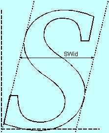
Swid
The uppercase S glyph is used to measure the SWid(Figure 6)
variable. This horizontal measurement is taken from the left-most
extent of the upper bowl to the right-most extent of the lower bowl.
Because these two points will not fall on the same horizontal plane,
skewing is required for italic glyphs. The skewing angle used for this
measurement should be the same as that derived in the skew measurement
taken on the uppercase H in the serif classification digit (the eighth
PANOSE digit).
Hwid
The HWid (Figure 2) is
measured on the uppercase H, from the left theoretical stem edge of the
left stem to the right theoretical stem edge of the right stem. It is
taken along an imaginary line coincident with the average horizontal
location of the bottom of the horizontal crossbar of the character.
Figure 7 - Upper O
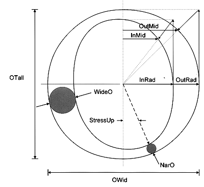
OWid
OWid (Figure 7) is the
horizontal measurement that reflects the general width of the uppercase O
glyph. It is measured from the left-most extent of the left side of the
stroke, to the right-most extent of the right side of the stroke. The
uppercase O glyph sample being measured should be the same size font as
was used on the S glyph used for the SWid measurement. Again, as with
the SWid, if a skewed, italic, or oblique font is being classified, be
certain to skew the left and right locations in order to obtain a true
horizontal measurement.
OTall
OTall (Figure 7) depicts the
height of the uppercase O glyph. It is a vertical measurement from the
outside edge of the stroke at the top-most extent to the outside edge of
the stroke at the bottom-most extent of the glyph. Skewed, italic, or
oblique characters should not skew this measurement. It should remain
strictly vertical. The uppercase O glyph should be the same size font as
the S glyph used for the SWid measurement. Note: OTall will generally
be slightly larger that CapH due to the subtle Baseline and Capline
overlaps.
Figure 8 - MWid
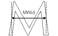
MWid
Due to various topological variations used in the uppercase M character, the MWid(Figure 8) measurement is taken differently from the EWid(Figure 5), HWid(Figure 2), and SWid(Figure 6)
measurements. The horizontal width of the uppercase M glyph is measured
at the exact mid-height of the glyph from the left-most edge of the
stroke on the left stem to the right-most edge of the stroke on the
right stem. No approximations of theoretical edges are used for this
measurement, nor are any alterations required for skewed glyphs.
Figure 9 - JWid
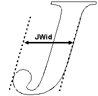
Jwid
The width of the uppercase J, JWid(Figure 9),
is a horizontal measurement from the right theoretical edge of the stem
to the left-most extent of the bowl or tail of the glyph, including any
serif extensions on the left side. Again, in this case, since the two
points may not fall on the same horizontal plane, the measurements must
be skewed for non-upright glyphs.
CapH
The CapH (Figure 2) is used
again in the determination of proportion measurement used to specify the
cap height and is measured on the uppercase H, from the top-most
Y-extent to the bottom-most Y-extent along the theoretical midline of
the left vertical stroke. The midline is chosen to avoid serifs that
extend the height or depth of the glyph. This is a vertical measurement,
regardless of italic or oblique stress.
Calculated Variables
There are eight calculated variables used to determine the correct Proportion digit for a typeface design:
ThinAv = (EWid + SWid) / 2
WideAv = (OWid + HWid) / 2
CalcEm = CapH * 1.5
ThinRat = CalcEm / ThinAv
WideRat = CalcEm / WideAv
PropRat = WideRat / ThinRat
JMRat = JWid / MWid
ORat = OTall / OWid
Classification
The objective of the
Proportion category is to evaluate the relative widths of specific
characters and assign the typeface into one of nine PANOSE Proportion
digits. This is accomplished by first removing the non-normal
proportioned glyphs and then segmenting the remaining designs into one
of three normal proportion genres. These variables are set up such that
the character widths themselves are not evaluated but rather the aspect
ratios of these glyphs by setting them against a calculated Em width.
To isolate monospaced font
designs, the ratio of the width of the uppercase J to the width of the
uppercase M (JMRat) is evaluated. More than any other two characters in
the Latin glyph set, these two characters can readjust their character
shape in order to better conform to a uniformly spaced font. If the
JMRat is greater than or equal to 0.78 the font is classified as
9-Monospaced. The monospaced fonts are classified first because they are
often condensed in appearance in addition to being monospaced in
design.
For those fonts not
classified as monospaced, the shape of the uppercase O is evaluated to
identify unusually narrow or wide glyph shapes. The ratio of the width
to the height of the uppercase O glyph is reflected in the ORat
variable. If ORat is greater than or equal to 1.27, the font is
classified as 6-Condensed. Further, if ORat is greater than or equal to
2.0, the PANOSE digit for Proportion is 8-Very Condensed.
Similarly, the extended fonts
are also identified by examining the ORat variable. In this case the
font is classified as 5-Extended if ORat is greater than or equal to
0.90 and less than 0.92. If the ORat value is less than 0.90 the font is
further classified as 7-Very Extended.
Finally, those fonts not yet
classified are evaluated by stricter criteria to separate them into
three normal proportion schemes. The PropRat value can be inserted into
the table below to obtain the PANOSE Proportion digit for these faces:
2-Old Style…………………… PropRat < 0.70
3-Modern……………….0.70 £PropRat < 0.83
4-Even Width …………..0.83 £PropRat < 0.90
The nine classifications for the Proportion digit are as follows:
0-Any
1-No Fit
2-Old Style……………… JMRat < 0.78 and 0.92 £ ORat < 1.27 and PropRat < 0.70
3-Modern …………………JMRat < 0.78 and 0.92 £ ORat < 1.27 and 0.70 £ PropRat < 0.83
4-Even Width………………JMRat < 0.78 and 0.92 £ ORat < 1.27 and 0.83 £ PropRat £ 0.91
5-Extended …………………JMRat < 0.78 and 0.90 £ ORat £ 0.92
6-Condensed ………………JMRat < 0.78 and 1.27 £ ORat < 2.1
7-Very Extended………….. JMRat < 0.78 and 0.85 £ ORat < 0.90
…………………………………(if ORat < 0.85 go to Decoratives - Section 4)
8-Very Condensed………… JMRat < 0.78 and 2.1 £ ORat < 2.6
…………………………………(if ORat > 2.1 go to Decoratives - Section 4)
9-Monospaced……………. JMRat ³ 0.78
Notes
PANOSE’s Proportion digit has very narrow tolerances
overall for the different classification options. There will be several
cases where common knowledge of historical typographic attributes will
conflict with the categories that the measurements prescribe for
classifying a face. In these cases, the measurements win out over the
characteristic design of the face.
Separate definition of the monospaced attribute is
provided to differentiate these typographically constrained faces. A few
typefaces will be isolated by the JMRat evaluation that are not truly
monospaced fonts. Most prone to this error are modern faces with nearly
even widths or condensed faces. Since character advancement width
metrics are not evaluated in the PANOSE Typeface Matching System, there
is no visual grounds for correctly identifying a monospaced font. If the
face being classified is known to contain monospaced character widths,
the digit 9-Monospaced can be assigned even if the JMRat test fails to
validate this classification.
Similarly, if a known proportionally spaced font
happens to be isolated as monospaced due to the glyph design of the
uppercase J and uppercase M, the monospaced classification can be
ignored and the font can be classified by using the subsequent
parameters. This subjective dismissal of a PANOSE trait is highly
unusual and is an exception to the rule.
Since the tolerances are so tight for the three
proportion options of Old Style, Modern, and Even Width, some fonts will
straddle these boundaries and end up with different proportional
classification due to changes in their weight or style. The font should
always be classified by the results of the PropRat variable in these
cases, not by what the majority of the family is assigned or what the
known historical information may indicate.
Similarly there will be rare cases where a typically
non-condensed face uses a narrow enough uppercase O glyph to be
classified as a condensed letterform and visa versa. Again, enter the
number dictated by the classification system, rather than the name of
the font. There are several faces that appear condensed whose names do
not contain the word “condensed.”
Also note that extremely condensed or extended
designs are usually classified as Decoratives. If ORat exceeds the
limits listed above, it is good evidence that a Decorative
classification should be considered (see Section 4).
2.5 Contrast
Sub-digits
0-Any
1-No Fit
2-None
3-Very Low
4-Low
5-Medium Low
6-Medium
7-Medium High
8-High
9-Very High
Description
The Contrast digit describes the ratio between the
thickest point on the stroke of the letter O and the narrowest point on
the letter O. This ratio is called the ConRat and involves two
relatively straight forward measurements.
The glyph shape of the uppercase O is used to
calculate the contrast digit because it is generally of higher contrast
than the other characters of the alphabet. For instance, the thick
segments of the uppercase O are wider than the thick segments of other
letters of the alphabet. This measurement of contrast with the rounded
character shapes is used because it emphasizes the contrast of the
character shape, thus giving greater separation of visual traits in
classification. The ratio of narrow to wide is used for contrast because
it defines the degree of variation in the letterform as it changes from
thick to thin.
This measurement should not be confused with the
sixth PANOSE digit, Stroke Variation. Stroke variation classifies the
transition process between the thick and thin segments of the uppercase
O, the relative values themselves.
Measurements
The contrast digit is calculated using two measurements, WideO and NarO (Figure 7).
These two measurements are often quite simple to determine. With
advanced or calligraphic character shapes determining the location where
the stem is at its maximum or minimum width is often more challenging.
For this reason, it is recommended that a large sample is used to
calculate the Contrast digit.
WideO
This variable is assigned by measuring the stem of the
uppercase O glyph where it is thickest. Often this will be at the right
or left-most extent of the letter-form, measured in a horizontal line.
Note: DO NOT CONFUSE WITH OWID! OWid specifies the character width rather than the stroke width.
NarO
Similar to WideO, this variable is assigned by
measuring the narrowest point of the uppercase O glyph, usually the top
most extent of the letter-form and, in this case, is measured
vertically.
If diagonal stress has been applied to the shape of
the uppercase O glyph the points of highest contrast may not occur at
the top and bottom or furthest left and right extent of the glyph. In
this case, WideO and NarO are the positions on the glyph where the
difference between the inside and outside radials has the maximum and
minimum value respectively.
The rule for determining the radials for the purpose
of this classification method is that they must cross the outer edge of
the glyph perpendicular to a line that is tangent to the stroke. The
radials can usually be determined by locating the character center and
drawing a line straight out through the glyph. Yet, in some exaggerated
letterforms, specifically flattened, rounded, or off-center glyph
shapes, a center-based radial will not provide a measurement that is
perpendicular to the stroke. In these complex character shapes, the
WideO and NarO must be measured using the radial differences method
mentioned in the previous paragraph.
Calculated Variables
ConRat
ConRat = NarO / WideO
If the ConRat variable is greater than one, there is
horizontal stress on the letter; This indicated that the font should be
classified as a Decorative design (Section 4).
Classification
To determine the exact PANOSE digit for contrast, fit the contrast ratio (ConRat) into the following table:
0-Any
1-No Fit
2-None……………….. 0.80 < ConRat
3-Very Low………….. 0.65 < ConRat £ 0.80
4-Low …………………0.48< ConRat 0.65
5-Medium Low……….. 0.30 < ConRat £ 0.48
6-Medium……………. 0.20 < ConRat £ 0.30
7-Medium High ……….0.15 < ConRat £ 0.20
8-High………………… 0.08 < ConRat £ 0.15
9-Very High………………… ConRat £ 0.08
Notes
This digit only evaluates a glyph’s contrast, which
in this case is described by the ratio between the thickest and the
narrowest points on the uppercase O. The angle of the stress and speed
with which the character’s stem width tapers from thick to thin are
handled by subsequent PANOSE digits.
It is not necessary to record the location where
WideO and NarO are measured to determine a font’s contrast. However,
these positions will be required for later classification of the sixth
PANOSE digit, Stroke Variation.
While the contrast calculation does not require
modifications to the measurement process for classification f italic
characters, note that italic variations of roman letter-forms commonly
have lower contrast than their non-italic counterparts. This can cause
families to break across different contrast settings due to changes in
the italic design. A simple oblique rendition of a standard symmetrical
design will not effect the contrast value.
Similarly, a glyph’s contrast classification may
change as the weight changes. For example, a typeface classified as
having medium contrast in a low weight design may have increased
contrast when the weight increases. Similarly, if a font is classified
as having high contrast it is likely that the contrast will decrease as
the weight increases. PANOSE does not regularize these values across
typeface families, but instead accepts them as a visual change that is
weight dependent.
A stencil, script, or overly decorative character
that does not have a closed path, or form a continuous circle is
classified as having a contrast of 1-No fit. This should be treated as a
warning sign that possibly classification as Handwritten (Section 3) or
Decorative (Section 4) will be more suitable for this face.
Notice that some contrast can exist in faces that are
classified as 2-No Contrast. This is representative of the fact that
typefaces are rarely designed with absolutely no contrast. Even glyphs
that appear to have consistent stroke thickness throughout the
letter-form, generally employ some amount of contrast. The contrast
classification of 3-Very Low addresses glyphs where the alteration of
the weights of the thick and thin stems begins to become visually
apparent rather than an optical embellishment.
2.6 Stroke Variation
Sub-digits
0-Any
1-No Fit
2-No Variation
3-Gradual/Diagonal
4-Gradual/Transitional
5-Gradual/Vertical
6-Gradual/Horizontal
7-Rapid/Vertical
8-Rapid/Horizontal
9-Instant/Vertical
10-Instant/Horizontal
Description
The contrast classification of a given font specifies
the relationship between the thicknesses of the thin stems and the wide
stems. The Stroke Variation category further details the contrast trait
by describing the kind of transition that occurs as the stem thickness
changes on rounded glyph shapes. Two attributes of transition are
classified, the angle of the transition and the speed of the transition.
Note: If the previous digit (Contrast) resulted in 2-No Contrast, then
the Stroke Variation digit is 2-No Variation.
Measurements
The speed of the transition of the stem weight in
rounded characters is classified by comparing the curvature of the outer
edge of the glyph to the curvature of the inner edge.
PANOSE uses a unique and simple method for
determining the conformance of any given ellipse to a purely oval path.
These measurements are the most specific in the PANOSE Classification
Metrics Guide and require extreme precision. Whenever possible, the
measurements should be taken from a sample that is 400 points in size.
Computer-generated 0.25 point vertical and horizontal rules are also
very useful.
OutRad
OutRad(Figure 7), or the
outer radius, is a horizontal measurement taken on the uppercase O, from
the center of the glyph to the right-most extent of the glyph shape.
OutMid
There are several steps involved in determining the OutMid(Figure 7)
measurement. The upper right corner of the uppercase O is used to
determine the OutMid. The OutMid is a horizontal measurement that
extends from the middle of the character to the character edge. Unlike
the OutRad, the vertical placement of this measurement is not at the mid
point of the glyph, but rather at a point specified by the intersection
of a diagonal bisecting line referred to as the Inter-edge line.
The Inter-edge line is drawn from the glyph center to
the intersection of two lines, one horizontal and one vertical, that
indicate the vertical location of the upper extent of the character and
the horizontal location of the right-most extent of the character. On a
perfect circle, the resulting Inter-edge line is at a 45º angle.
With the Inter-edge line correctly drawn, the OutMid
can be determined. It is a horizontal measurement taken from the
horizontal mid point of the glyph to the point where the Inter-edge line
intersects the outer edge of the glyph shape.
In non-upright characters, all vertical lines for measuring distances are skewed to match the oblique angle.
These two variables, OutRad and OutMid, are used to
determine the curvature of the outer ellipse of the uppercase O glyph.
These same measurements will be used later in the Letterform category to
assign an overall character roundness value to a given font. To
determine the speed of stoke transition, the curvature of the inner
ellipse of the uppercase O must also be determined. The same process
described above is repeated for the inside of the uppercase O glyph with
InRad and InMid.
InRad
InRad(Figure 7) is the
inside radius of the uppercase O. This horizontal measurement is taken
on the same line used for OutRad, but the measurement is taken from the
center of the glyph to the inside edge of the right stroke of the
character.
InMid
This measurement is similar to the OutMid(Figure 7)
measurement; in this case the Inter-edge line is drawn from the upper
and right-most extents of the inner ellipse of the uppercase O.
It is a common measurement error to use the wrong
Inter-edge line when both the InMid and the OutMid are measured on the
same sample. Always verify that the correct Inter-edge line is being
used for the correct variable measurement.
StressUp
The angle of the stress of the rounded glyphs is
characterized by locating the point at which the outer ellipse and inner
ellipse of the uppercase O are closest together and measuring that
point’s angle to the center of the glyph. Intuitively picture the inner
and outer ellipses as rails; the goal is to see where a ball that rolls
between those rails fits the tightest.
Mathematically, the location can be found by locating
the smallest value returned when measuring a line that is tangent to
the outer ellipse to where that line crosses the inner ellipse. Once
that point is determined, a line is drawn from that point to the center
of the glyph. The line formed is the StressUp (Figure 7) value.
StressLo
The StressLo variable is similar to the StressUp
variable, except in this case the measurements are taken on the
lowercase o.
Calculated Variables
There are three calculations necessary to determine a font’s stem transition speed.
OutCurv = OutMid / OutRad
InCurv = InMid / InRad
Speed = OutCurv / InCurv
The resulting Speed variable is then fit into the “Speed Table” below to obtain the transition speed attribute.
Speed Table:
Speed ³ .96 …………= Gradual
.85 < Speed < .96 ….= Rapid
Speed £ .85 ………= Instant
The stress of the uppercase and lowercase O (CapStress and LowerStress) is used to normalize oblique glyphs.
CapStress = StressUp - Slant
LowerStress = StressLo - Slant
Classification
The stroke variation digit is 2-No Variation if the
previous digit resulted in 2-No Contrast. If the font has contrast, the
transition speed is assigned for the font. If the speed is less than or
equal to 0.85, the typeface is classified with the Stroke Variation
value, Instant. If the Speed value is greater than or equal to 0.96, the
font is classified as having Gradual speed. Finally, if the Speed
values lies between 0.85 and 0.96 it is classified as Rapid.
The Stroke Variation classification continues by evaluating the stress of the uppercase O glyph.
If StressUp is less than or equal to 98º and greater
than or equal to 82º, the stress of the lowercase is also evaluated. If
the value for StressLo is also less than or equal to 98º and greater
than or equal to 82º, the font is classified as having Vertical stress.
If the value for StressLo is greater than 98º or is less than 82º, the
font is classified as having Transitional stress.
If the StressUp value is greater than 98º and less
than or equal to 172º, it is not necessary to check the StressLo
variable. The font is classified as having Diagonal stress.
Finally if the StressUp variable is greater than or
equal to 172º and less than or equal to188º, the font is classified as
having Horizontal stress.
You can determine the stress based on the following information:
Horizontal = CapStress = 0 ± 8, or 180 ± 8
Vertical = CapStress = 90 ± 8
If vertical check LowerStress
if LowerStress = CapStress, stress is Vertical
if LowerStress CapStress, stress is Transitional
All else is Diagonal
0-Any
1-No Fit
2-No Variation
3-Gradual/Diagonal …………Speed ³0.96 and 98º < StressUp< 172º
4-Gradual/Transitional ……..Speed ³0.96 and [(82º £StressUp £98º) and (StressLo >98ºor StressLo > 82º)]
………………………………OR[(Slant < 82º or Slant >98º) and |CapStress| <8 and |LowerStress| ³ 8]
5-Gradual/Vertical …………Speed ³ 0.96 and [(82º £ StressUp £ 98º) and (82º £StressLo £98º)]
………………………………OR [(Slant < 82º or Slant >98º) and |CapStress| <8 and |LowerStress| < 8]
6-Gradual/Horizontal………Speed ³ 0.96 and 172º £ StressUp £ 196º and 172º £ StressLo £ 196º
7-Rapid/Vertical……………0.85 < Speed < 0.96 and [(82º £ StressUp £ 98º) and (82º £ StressLo £ 98º)]
………………………………OR [(Slant <82º or Slant > 98º) and |CapStress|< 8 and |LowerStress| <8]
8-Rapid/Horizontal…………0.85 < Speed < 0.96 and 172º £ StressUp £ 196º and 172º £ StressLo £ 196º
9-Instant/Vertical…………Speed £0.85 and [(82º £StressUp £98º) and (82º £StressLo £98º)]
………………………………OR [(Slant <82º or Slant > 98º) and |CapStress|<8 and |LowerStress| <8]
10-Instant/Horizontal ……..Speed £0.85 and 172º £StressUp £196º and 172º £StressLo £196º
Notes
If you examine the logical cross products of the
different attributes that are classified in this category, you will
notice that some combinations are not available, such as Rapid
Transitional and Rapid Diagonal. These have been omitted due to their
extreme rarity. If in the course of your classification you run across a
hybrid mix of attributes such as these, the following priorities will
determine the correct classification: for speeds above .85, speed is the
determining characteristic; for speeds below .85, stress is the
determining characteristic.
2.7 Arm Style
Sub-digits
0-Any
1-No Fit
2-Straight Arms/Horizontal
3-Straight Arms/Wedge
4-Straight Arms/Vertical
5-Straight Arms/Single Serif
6-Straight Arms/Double Serif
7-Non-Straight/Horizontal
8-Non-Straight/Wedge
9-Non-Straight/Vertical
10-Non-Straight/Single Serif
11-Non-Straight/Double Serif
Description
The Arm Style category classifies two attributes of a
glyph design: special treatment of diagonal stems and termination of
open rounded letterforms. Most font designs will classify as Straight
Arms/Wedge or Straight Arms/Single Serif. The uppercase A and C are used
extensively for this classification. Other letters which determine the
Arm Style setting are uppercase G, M, S, V, W, and Y.
A Measurements
Figure 10 - Upper A Measurements
ArmAHi ArmALo
The thickness of the left diagonal stem of the uppercase A is described by the ArmAHi and ArmALo(Figure 10)
variables. These measurements are taken by projecting the theoretical
stem edges of the left stem out to the baseline and capline of the
letter. The ArmAHi measurement is then determined by measuring the
thickness of the stroke at the capline. Similarly, the ArmALo is
measured at the baseline. Both measurements are taken perpendicular to a
line that depicts the middle of the stem.
ArmCurv
The curvature of the diagonal arms is captured by the ArmCurv(Figure 10)
variable. This measurement is taken at the mid point of an imaginary
line which is drawn from the point where the left theoretical edge of
the uppercase A intersects the baseline and capline. This line will
often be coincident with the edge of the stem; the cases when this is
not true need to be measured. The measurement is taken from the mid
point of the imaginary line to the actual left edge of the stem. In the
case of a concave stem this will result in a negative number, in the
case of a bowed stem this will result in a positive number.
CapH
CapH(Figure 2) is the cap
height and it is measured on the uppercase H, from the top-most Y-extent
to the bottom-most Y-extent along the theoretical midline of the left
vertical stroke. The midline is chosen to avoid serifs that extend the
height or depth of the character shape. This is a vertical measurement
regardless of whether the character is italic or oblique.
Figure 11 - Cut Count
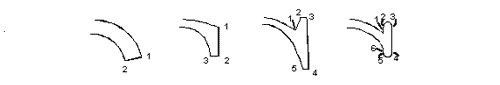
CutCountHi CutCountLo
The two CutCount (Figure 11)variables
depict the number of corners at both terminations of the uppercase C.
This measurement is only applied to serif letter forms and indicates the
amount of serif detailing at the ends of the stroke. The procedure for
this variable is loosely defined so as not to impede the simple goal of
this attribute. Each surface of the detail at the termination of the C
that is not a part of the major curve of the glyph is determined. From
these surfaces the corners are counted and those counts determine the
values for the CutCount variables. This process is completed for both
the upper and lower termination of the uppercase C.
Figure 12 - Cut Pitch
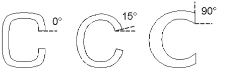
CutPitch
The angle of termination on an uppercase C for a sans serif glyph is stored as the CutPitch(Figure 12).
This measurement is not taken on serif letterforms. The angle produced
by the two points that terminate the upper stroke of the uppercase C is
used to describe this variable. The left-most of the two points is used
as the fulcrum of the angle. In the case of a highly rounded corner
style at the termination of the stroke, the theoretical edge of the
stroke must be determined and its angle recorded. The treatment of the
lower termination of the stroke is not factored into this attribute.
Calculated Variables
TaperRat = ArmAHi / ArmALo
CurvRat = ArmCurv / CapH
CutRat = CutCountLo / CutCountHi
Classification
Of the two traits that are classified in this
category, the arm is determined first. The termination treatment is
determined separately as a second process.
There are three different kinds of non-straight arms
that are classified in this category. They are: tapered (or
non-parallel), bowed, and concave. Different variables are evaluated to
check for the existence of these different arm styles.
To assess whether the arms are non-straight the
difference between the ArmAHi and ArmALo values are checked. This is
done by evaluating the TaperRat variable. The arm is considered
non-parallel if the TaperRat is less than 0.6.
Bowed and concave arms are isolated with the CurvRat
variable. If the absolute value of CurvRat is greater than or equal to
0.02 then the arm is considered non-straight. Notice that the CurvRat
will not indicate whether the arms are bowed or concave, only that they
are not straight. The CurvRat variable will result in an error if the
arm is completely straight.
Next, evaluate the treatment of the uppercase C
opening. CutPitch is used for analysis of sans serif faces (10 <
digit 2 <14).
353º < CutPitch £ 7º = Horizontal
7º < CutPitch £ 83º = Wedge
83º < CutPitch < 112º = Vertical
The CutCount values compare the complexity of the
upper and lower serifs on the uppercase C glyph. This step is overly
complex for manual classification of faces. The CutCount values are
helpful if you are writing programs to classify type. CutCount is used
to distinguish between a single or double serif termination on the
uppercase C. If a face is difficult to determine, use the rule: CutRat £ 0.75 = Single Serif.
The attributes of “Straight” or “Non-Straight” arms
are paired with the attributes of “Horizontal,” “Wedge,” “Vertical,”
“Single Serif,” or “Double Serif” to determine the final classification
digit for Arm Style in the table below:
0-Any
1-No Fit
2-Straight Arms/Horizontal …………TaperRat ³ 0.60 or CurvRat < 0.02 and CutPitch < 7
3-Straight Arms/Wedge…………….. TaperRat ³0.60 or CurvRat < 0.02 and 7º < CutPitch < 83º
4-Straight Arms/Vertical…………… TaperRat ³ 0.60 or CurvRat < 0.02 and 83º < CutPitch < 112º
5-Straight Arms/Single Serif ………..TaperRat ³ 0.60 or CurvRat < 0.02 and CutCount £ 0.75
6-Straight Arms/Double Serif ……….TaperRat ³ 0.60 or CurvRat < 0.02 and CutCount > 0.75
7-Non-Straight/Horizontal…………. TaperRat < 0.60 or CurvRat ³ 0.02 and CutPitch < 7
8-NonStraight/Wedge………………. TaperRat < 0.60 or CurvRat ³ 0.02 and 7º < CutPitch < 83º
9-Non-Straight/Vertical ……………..TaperRat < 0.60 or CurvRat ³ 0.02 and 83º < CutPitch < 112º
10-Non-Straight/Single Serif……….. TaperRat < 0.60 or CurvRat ³ 0.02 and CutCount £ 0.75
11-Non-Straight/Double Serif ……….TaperRat < 0.60 or CurvRat ³ 0.02 and CutCount > 0.75
Notes
Diagonal arms of sans serif letterforms will often
bow when the proportion of the glyphs becomes very condensed, causing
this extremely rare attribute to change within a family.
Some fonts use a different topology for the uppercase
A that resembles more of a inverted horseshoe than a triangle. These
fonts should be classified as 1-No Fit for this category and may
indicate a Decorative face. Check the family size and the availability
of italics. If there are none go to Section 4.
2.8 Letterform
Sub-digits
0-Any
1-No Fit
2-Normal/Contact
3-Normal/Weighted
4-Normal/Boxed
5-Normal/Flattened
6-Normal/Rounded
7-Normal/Off Center
8-Normal/Square
9-Oblique/Contact
10-Oblique/Weighted
11-Oblique/Boxed
12-Oblique/Flattened
13-Oblique/Rounded
14-Oblique/Off Center
5-Oblique/Square
Description
Most sophisticated typeface designs alter the
roundness of the character shapes in order to give the font a
distinctive appearance or balance of white-space. This roundness is
classified in the Letterform category. In addition to the glyph
roundness, the predominant skewing of the character forms is also
recorded and used to isolate oblique characters.
Measurements
The measurements that were used to determine the
speed trait for the Stroke Variation digit are also used to determine
the roundness component of the Letterform digit. Only the outer ellipse
variables are used in this category.
OutRad
OutRad(Figure 7), or the
outer radius, is a horizontal measurement taken on the uppercase O, from
the center of the glyph to the right-most extent of the glyph shape.
OutMid
There are several steps involved in determining the OutMid(Figure 7)
measurement. The upper right corner of the uppercase O is used to
determine the OutMid. The OutMid is a horizontal measurement that
extends from the middle of the character to the character edge. Unlike
the OutRad, the vertical placement of this measurement is not at the mid
point of the glyph, but rather at a point specified by the intersection
of a diagonal bisecting line referred to as the Inter-edge line.
The Inter-edge line is drawn from the glyph center to
the intersection of two lines, one horizontal and one vertical, that
indicate the vertical location of the upper extent of the character and
the horizontal location of the right-most extent of the character. On a
perfect circle, the resulting Inter-edge line is at a 45º angle.
With the Inter-edge line correctly drawn, the OutMid
can be determined. It is a horizontal measurement taken from the
horizontal mid point of the glyph to the point where the Inter-edge line
intersects the outer edge of the glyph shape.
In non-upright characters, all vertical lines for measuring distances are skewed to match the oblique angle.
These two variables, OutRad and OutMid, are used to
determine the curvature of the outer ellipse of the uppercase O glyph.
These same measurements will be used later in the Letterform category to
assign an overall character roundness value to a given font. To
determine the speed of stoke transition, the curvature of the inner
ellipse of the uppercase O must also be determined. The same process
described above is repeated for the inside of the uppercase O glyph with
InRad and InMid.
OTall
OTall(Figure 7) measures the
height of the uppercase letter O. It is a vertical measurement from the
outside edge of the stroke at the top-most extent to the outside edge
of the stroke at the bottom-most extent of the glyph.
CentDist
The CentDist variable is needed to classify those
designs that place the visual center of the fully round letterforms off
true center. This measurement is taken by measuring the vertical
distance from the baseline to the point at which the edge of the glyph
reaches the right-most extent of the letterform. The line that defines
the right-most extent must be skewed to match the character slant for
this measurement.
Slant
The slant(Figure 2)
determines whether a typeface is normal and upright or oblique in
design. The Uppercase H is used to measure the angle of the glyph and is
taken between the outside angle of the theoretical edge of the left leg
and the baseline. This value is then subtracted from 90 to arrive at
the Slant variable.
Calculated Variables
OutCurv = OutMid / OutRad
CentProp = CentDist / OTall
Analysis
Because two traits are being handled in this
classification category, two separate classification processes are
conducted. First the slant of the glyph is evaluated to isolate the
oblique font designs. Next, the curvature of the rounded characters is
determined by using the OutCurv variable
Obliques are isolated by evaluating the Slant variable. If it is less than 85º, the glyph is considered Oblique.
The following two steps classify the roundness of the letterform:
1. Check for off-center glyphs. If the widest
horizontal point of the uppercase O is more or less than 6% from the
physical center of the glyph, the face is classified as Off Center.
Hence, if CentProp is greater than 0.56 or less than 0.44 then the Off
Center attribute is assigned.
2. If the font is not classified as Off Center, the OutCurv value is fit into the following list:
Contact = ……………OutCurv < 0.74
Weighted =…..0.74 £OutCurv £0.77
Boxed =……. 0.77 < OutCurv £0.80
Flattened =…. 0.80 < OutCurv £0.83
Rounded =…. 0.83 < OutCurv £0.95
Square =……. 0.95 < OutCurv
Classification
0-Any
1-No Fit
2-Normal/Contact ………Slant ³85 and OutCurv < 0.74 and 0.44 £CentProp £0.56
3-Normal/Weighted ……..Slant ³85 and 0.74 £OutCurv £0.77 and 0.44 £CentProp £0.56
4-Normal/Boxed …………Slant ³85 and 0.77 < OutCurv £0.80 and 0.44 £CentProp £0.56
5-Normal/Flattened ………Slant ³85 and 0.80 < OutCurv £0.83 and 0.44 £CentProp £0.56
6-Normal/Rounded……… Slant ³85 and 0.83 < OutCurv £0.95 and 0.44 £CentProp £0.56
7-Normal/Off Center……. Slant ³85 and 0.44 > CentProp > 0.56
8-Normal/Square …………Slant ³85 and OutCurv < 0.95 and 0.44 £CentProp £.056
9-Oblique/Contact………. Slant < 85 and OutCurv< 0.74 and 0.44 £CentProp £0.56
10-Oblique/Weighted……. Slant < 85 and 0.74 < OutCurv£ 0.77 and 0.44 £CentProp £0.56
11-Oblique/Boxed……….. Slant < 85 and 0.77 <OutCurv £0.80 and 0.44 £CentProp £0.56
12-Oblique/Flattened …….Slant < 85 and 0.80 <OutCurv £0.83 and 0.44 £CentProp £0.5
13-Oblique/Rounded…….. Slant < 85 and 0.83 < OutCurv£ 0.95 and 0.44 £CentProp £0.56
14-Oblique/Off Center…… Slant < 85 and 0.44 >CentProp > 0.56
15-Oblique/Square ……….Slant < 85 and OutCurv< 0.95 and 0.44 £CentProp £0.56
Notes
Oblique is a general classification that is intended
to catch most italic letterforms and all oblique variants of sans serif
faces. There are cases where a Roman face will classify as an oblique
due to the amount of character skew that is incorporated in the design.
The Oblique setting should not be assigned due to knowledge of the
intent of the face, but rather strictly on the visual trait of glyph
skewing. In the rare case where both the Roman and Italic components of a
font family classify as italic you can override the classification
recommendation given for the Roman.
The roundness of a character as stated above is a
very subtle detail that determines a great deal about a given fonts
appearance. Due to the subtle nature of this measurement and its
classification parameters, you can expect some families to break across
different roundness values from the roman to the italic face.
2.9 Midline
Sub-digits
0-Any
1-No Fit
2-Standard/Trimmed
3-Standard/Pointed
4-Standard/Serifed
5-High/Trimmed
6-High/Pointed
7-High/Serifed
8-Constant/Trimmed
9-Constant/Pointed
10-Constant/Serifed
11-Low/Trimmed
12-Low/Pointed
13-Low/Serifed
Description
The ninth category in the PANOSE classification
system analyzes two traits, the placement of the midline across the
uppercase characters and the treatment of diagonal stem apexes. The
midline classification falls into one of four sub-categories: Standard,
High, Constant, and Low. The apex treatment has only three variants:
Trimmed, Pointed, and Serifed.
Measurements
MidE
The MidE(Figure 5) variable
specifies the distance of the center of the middle horizontal arm of the
uppercase E from the baseline. This measurement is strictly vertical
and is not changed for non-upright letterforms. If necessary, the
measurement is also taken from the midpoint on the stem to avoid
curvature or stem slanting that may be incorporated into the font’s
design.
CapH
CapH(Figure 2) is the cap
height and it is measured on the uppercase H, from the top-most Y-extent
to the bottom-most Y-extent along the theoretical midline of the left
vertical stroke. The midline is chosen to avoid serifs that extend the
height or depth of the character shape. This is a vertical measurement
regardless of whether the character is italic or oblique.
MidA
Like the MidE, MidA(Figure 10)
represents the distance from the center of the horizontal arm of the
uppercase A to the baseline. To accommodate for extravagant letterforms,
this measurement is taken at the horizontal midpoint of the glyph.
Again, this is a vertical measurement and is not altered for italic
characters.
ACap
The ACap(Figure 10)
variable measures the amount of flatness at the apex of the uppercase A.
Most often, this is a simple horizontal measurement taken at the upper
extent of the letterform. In more sophisticated designs, it may be
necessary to take this measurement at an angle along a theoretical edge
for the upper apex. It is common to have a font design that contains no
flatness at the apex of the uppercase A glyph, or where the apex is
highly rounded. In these cases, zero flatness is assigned. Note: If the
top of the A is serifed, project the theoretical edges of the right and
left stems through the serif, and measure the distance between them.
CapPitch
Many uppercase A glyph designs allow the right arm to
project through the left arm at the apex of the letterform.
Subsequently, that projected stem is then cut back to lessen its visual
prominence. The angle at which the stem is cut back is recorded in the
CapPitch variable which is determined by measuring the angle of the
theoretical tip of the uppercase A. This measurement (Figure 10)
will generally be between 0 and 90 degrees, and should be taken on any
design where the upper extent of the right diagonal arm creates a
surface that is not a rounding point for the apex.
ASerL ASerR
This variable is a point-count variable similar to the
CutCount field specified in the Arm Style digit. In this case the
corners, rounded or square, of the left and right sides of the apex of
the uppercase A are counted. A count of 1 is always entered for the
single corner at the apex. For example, If the apex forms a clean point,
both ASerL and ASerR (Figure 10) equal one.
WStem(E)
The E stem weight WStem(E) (Figure 5)
is measured horizontally at the x-height of the uppercase E, half way
between the upper two arms. This measurement is the width of the
vertical stem, or back bone, of the character. This measurement is to be
taken perpendicular to the stem. In the case of an oblique letter, the
horizontal axis is positioned perpendicular to the stem. Note: for the
purpose of serif designs, this measurement is applied to the large (400
point) uppercase I glyph.
Calculated Variables
EArm = MidE / CapH
AArm = MidA / CapH
ArmDif = EArm - Aarm
TrimRat = ACap / WStem(E)
ASer = (ASerL + ASerR) / 2
Classification
The classification of the midline digit requires two
separate sub-classifications. First the setting for the midline
placement is assigned, followed by the setting for the apex treatment.
The combination of these attributes form the Midline digit for PANOSE.
To determine the midline setting, first the constant
midlines are isolated by evaluating the ArmDif variable. If the ArmDif
is less than 0.08, then the placement of the arms is considered similar
and the font is classified as having a Constant midline. If the value of
the ArmDif is greater than or equal to 0.08, then the location of the
midline on the uppercase E is further evaluated to determine the correct
setting. If the EArm value is greater than 0.58, the font is classified
with a High midline position. If the EArm is less than 0.45 then the
font is classified with a Low midline position. The remaining fonts are
classified with a Standard midline setting.
To classify the apex treatment, the fonts with
complex serifs at the apex the uppercase A are isolated. This is done by
evaluating the ASer variable. If ASer is greater than 2, the font is
classified as having a Serif apex. If ASer is less than or equal to 2,
the apex is evaluated for flatness. This is done by evaluating the
TrimRat variable. If TrimRat is greater than or equal to 0.6 then the
font is classified as Trimmed. If the font has a TrimRat variable that
is less than 0.6, the font is classified as Pointed. If the uppercase A
glyph uses a non-triangular topology (i.e., semi-circular), then
evaluate the middle apex on the uppercase M glyph. If it is rounded, the
face classifies as trimmed.
0-Any
1-No Fit
2-Standard (ArmDif ³ 0.08, and 0.45 £ EArm £ 0.58),
…Trimmed (ASer £ 2, and TrimRat ³ 0.6)
3-Standard (ArmDif ³ 0.08, and 0.45 £ EArm £ 0.58),
…Pointed (ASer £ 2, and TrimRat ³ 0.6)
4-Standard (ArmDif ³ 0.08, and 0.45 £ EArm £ 0.58),
…Serifed (ASer > 2)
5-High (ArmDif ³ 0.08, and EArm > 0.58),
…Trimmed (ASer £ 2, and TrimRat ³ 0.6)
6-High (ArmDif ³ 0.08, and EArm > 0.58)
…Pointed (ASer £ 2, and TrimRat < 0.6)
7-High (ArmDif ³ 0.08, and EArm > .058),
...Serifed (ASer > 2)
8-Constant (ArmDif < 0.08)
…Trimmed (ASer £ 2, and TrimRat ³ 0.6)
9-Constant (ArmDif < 0.08)
…Pointed (ASer £ 2, and TrimRat < 0.6)
10-Constant (ArmDif < 0.08)
…Serifed (ASer > 2)
11-Low (ArmDif ³ 0.08, and EArm < 0.45),
…Trimmed (ASer £ 2, and TrimRat ³ 0.6)
12-Low (ArmDif ³ 0.08, and EArm < 0.45),
…Pointed (ASer £ 2, and TrimRat < 0.6)
13-Low (ArmDif ³ 0.08, and EArm < 0.45),
…Serifed (ASer > 2)
Notes
If a midline is classified as Constant, there is no
indication of the height of the midline. This is correct. In most cases,
the midline is standard or high, but there will be cases where the
midline may be very low and constant. These low, constant midlines are
correctly classified as Constant.
A medium weight font with a Constant midline usually
shifts its midline to Standard when additional weight is applied to the
letter.
The apex of many uppercase A glyphs occurs above the
capline. It should not be assumed that the capline provides a basis for
the apex flatness (ACap) measurement.
2.10 X-height
Sub-digits
0-Any
1-No Fit
2-Constant/Small
3-Constant/Standard
4-Constant/Large
5-Ducking/Small
6-Ducking/Standard
7-Ducking/Large
Description
Two different traits are represented in the X-height
digit: the treatment of uppercase glyphs with diacritical marks and the
relative size of the lowercase characters. The classification of these
traits are simple and straightforward. Note: If a face does not have
lowercase glyphs, it is a Decorative. See Section 4 for these
classification rules.
Measurements
Two measurements are used for calculating the
X-height. The height of the uppercase glyph for the typeface has already
been measured in the Serif Style digit by means of the CapH variable.
The lowercase height is measured as described in XTall. Similarly, the
uppercase is evaluated to determine how the glyph height is altered to
account for diacritical marks.
Figure 13 - Lower X
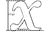
Xtall
XTall(Figure 13) is the
measurement of the lowercase characters from the baseline vertically to
the upper extent of the upper left stem of the lowercase x.
Figure 14 - A Ring
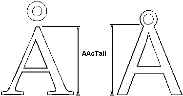
AAcTall
The height of the ARing character, “Å” (Figure 14)
is used to evaluate diacritical treatment. This is a vertical
measurement and is taken from the baseline to the upper extent of the
uppercase A portion of the ARing glyph. This measurement does not
include the size of the ring. In the cases where the ring is joined to
the uppercase A portion of the character, the measurement should be
taken from the baseline to the lower extent of the inner white-space of
the ring.
Calculated Variables
DuckRat = AAcTall / CapH
Rat = XTall / CapH
Classification
If a typeface has been designed such that extra space
is allotted in the Em square for diacritical marks, the uppercase
glyphs will not have to be foreshortened when diacritical marks are
applied. The DuckRat variable is used to indicate when a font is not
designed for normal diacritical use and needs to duck the height of the
uppercase letters.
If the DuckRat value is less than or equal to 0.93 the font design is considered to be a ducking design.
The XRat variable is used to determine the relative
size of the lowercase. The table below is used to classify fonts based
on the XRat.
Small = XRat £ 0.50
Medium = 0.50 < XRat £ 0.66
Large = 0.66 < XRat
Notes
As more fonts are designed for international markets,
the occurrence of Ducking font designs will subside. The reason for
including a classification of ducking versus non-ducking fonts is that
the visual height of the font is greatly effected by this treatment.
Fonts that have been designed to include diacritical marks have an
overall smaller visual height than fonts that utilize the entire space
above the baseline for uppercase characters.
More and more, fonts are being designed and re-cut
with larger x-heights. It is increasingly uncommon to classify a new
font with an x-height that is less than 66% of the uppercase.
While the original PANOSE System included
classification isolation of fonts which include no lowercase, this
version of the PANOSE Typeface Matching System has moved such faces to
the Latin Decorative family (Section 4).
Top
Section 3.0
|